yliix

Kamis, 10 Oktober 2013

Are you a seasonal decorator?

 All those pictures on Pinterest  over the last several weeks make me wonder to what degree the "average" person goes to celebrate changing seasons, holidays, etc.  I feel like I am letting my profession as an interior decorator down when it comes to special events decorating in my own home!

I  make some effort to decorate, but notice I said "some".  It will never wear me out or cost more than $20.00.   I usually choose several very simple changes to  give a gentle nod to any special event.  I am also a firm believer in using what you have in your house and garden.  If I can't figure out  something to do with what I have supported by a trip to  Dollarama, nothing happens.

 When I was younger I admit putting more effort and money  into seasonal decorating, but it all seems so over the top now, and surely I can find better things to do with the money I would have spent!  Simplifying has been my mantra for the last ten years. That goes for decorating too.

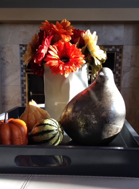
My current effort in the family room....

One gray tray; three gourds from  the supermarket; a ceramic paper bag vase purchased three years ago at Homesense for $ 9.99; a mercury stylized bird that is really a little too big, but I love it and it gets used everywhere; and daisies from the dollar store.  Sometimes I buy fresh, sometimes I use artificial. And best of all is the sun patterns on this glorious day.

It's colourful and simple. Here's more inspiration from Pinterest all with trays.


  One tiered tray; gourds; hydrangea, pinecones... so simple but would work well on a dining table because of  the height

 This one has a collection of objects from around the house (books and jars), pinecones and three clear jars with sedum.  The art work behind the vignette adds the autumn colour.


I can't say no to sunflowers and this vase just gives us more of that glorious yellow. Baskets of pinecone add texture and help play up the colour of the flowers.  Love the old woven basket.


Love the ceramic pumpkin on a cake tray surrounded by fall berries. Variety in heights and textures make this work well.  If you can have just one tray, a silver one shows up best on dark furniture.


This is as simple as you can get with candles in plain glasses, a distressed tray and some autumn foilage.


 And finally, good-bye from the table of my summer place.  No tray but lots of plants and shrubs from my garden.  White ceramic anything is a good purchase.  I love the shape of pears.


And I finish by asking again... are you a seasonal decorator?

Minggu, 06 Oktober 2013

What does your home say about you?

Is your home different from your friends or very similar?  Could someone match you to your home?  Are there things around that denote your interests,  pursuits etc.  or do you have a generic home?    I asked my husband if our home is like other homes we are familiar with or is ours different?  I found it interesting that he did not  readily identify the things in our home that make it different from other homes e.g., he made most of the furniture, stained glass, railings, etc.  It has the distinct marks of both of our interests. 

In an effort to describe the individual aspects of one person's home when compared to another, the design world often refers to a home's "personality".   I love to go into a home that "feels like" the people who live there.   In my book, designing a home with "personality" (the homeowners , not mine)  is one of the most difficult aspects of being a decorator.  I spend quite a bit of time getting a handle on the people I am working with and trying to  reflect that knowledge in the choices I make for their home.   I don't understand decorators who are known for a set "look" and anything they do is recognizable as their work  I loved the lady who told me she was looking for a Pottery Barn decorator!  Silly me had to ask what that meant. I'm much better dealing with an individual look.

 I am helping a friend solve several home dilemmas. We have agreed to work on this project over a long term basis.  She has little interest in  new trends for 2014 or what the most popular colours are this year.  Here house is totally wood except for ceramic  floors downstairs, and it has  personality galore, but it is not a house for everyone. We talk about function, natural materials, textures, warmth, minimal living, wabi sabi, zen spaces and  the "feel" she wants.  We talk about how her interests have changed and how this influences her living space.  It is not my usual decorating job, but I enjoy our chats and the progress we are making.  I am up to the task because I truly believe that my job is to listen well and lead the homeowner to a place where they make their own decisions. It takes longer, but it is more rewarding for everyone in the end.

These rooms all have very different personalities.  What do they say about the owners?  Look at your own space.  What does it say about you and the people who live there?


interested in what is currently in style and being in style, seems more comfortable in darker spaces that are soothing, likes luxury,  some personal touches in photos, likes symmetry and order. 


not concerned with current trends,likes the warmth of wood and can't get enough of it,    likes contained spaces,   hand made objects are important, likes a simple life 


current trends are important, likes luxury, entertains larger groups, likes comfort,  interested in the trappings of "the good life"


not interested in current trends, recycling is important, likes the marks of history on objects, not afraid to be an individual,  likes comfort and a functional space, likes nature, has an artistic eye


Insert  a room in your home here.  What does it say about you? 

Sabtu, 14 September 2013

It's all about scale


  Designers/decorators are like acrobats, always juggling the elements and principles of design to create  inviting and interesting spaces. These tools of the trade come easily when you spend your time immersed in design, but for the average person it takes a little more effort to pull together a truly well designed space. 

 One of the the most noticeable problems I see in many spaces  is a  lack of understanding/ application/ use of  proportion and scale. It's a biggie in my book. Playing with scale can be used to great effect, but  when done wrong it can creates visually uncomfortable spaces.


 Proportion and scale go hand in hand since both relate to size and shape. Proportion is about the ratio between the size of one part to another, and scale is how the size of one objects relates to another, to the space as a whole and  to the people who will inhabit the space . My best example of  disregarding scale is choosing a large overstuffed love seat, chair and sofa for a small space. Then imagine a petite couple living there! 


Yea or Nah, let's see what we think about these.... I've had my say....  (all images from my Pinterest board Pondering Scale)


When I feel that the scale of something is off I say the object in question looks "uncomfortable".  In the room above the clock looks very uncomfortable.  It has no room to breathe because it is totally hemmed in by the  the headboard and the night table.  Is it a great clock?  Yes...  Would it look better in another setting ?  I think so.  How about you? 

The urn next to the dresser  looks out of place in this space. While it is quite stunning and it fits in with the style of the other objects and furniture, it  needs a much larger space to shine.  It works with the scale of the dark dresser with TV on top, but it it just too large for the space between the two pieces of furniture.


 This is an elegantly designed space, but I am fussy about the scale of pillows to chairs/sofas.  To my mind they have to look good and be functional.  How would you ever sit on this chair?  Pillow to floor immediately!  A 12 in square or a lumbar pillow works well in a side chair.  If you want to add lots of pattern consider a throw folded over the back of a chair.


 We don't usually see pendants this large but in this space I think they work very well.  It helps that they are transparent.  The choice of  oversized pendants seems to be on the rise lately. 


  You will often see a small decorative mirror over a bed, but it rarely works to best effect.  I would choose a round mirror for this beautiful room and I quite like the gold finish.  I think it needs to be a tad larger.  Rule of thumb is 2/3 the width of the headboard.  Where  this space is  banked by two windows
 you could go a tad smaller that that but not as little as half which is what we have in the room above. 


 When you have a  very tall headboard or posts you need to scale up your lamp accordingly. I want this lamp to have a larger base and only slightly more height. It needs more presence.  Everything else about this space is just lovely.  

  I love the burlap with stripe and the glass base of this lamp,  but it gives  that uncomfortable feeling again.  How do you know which shade size (height and width) to choose for a lamp?   There are all kinds of formulas for this, but consider a shade that is  roughly  2/3 the height of the  lamp base up to where the socket begins and twice the width of the base. The shade above is not too bad height wise, but it needs to have a much larger shade diameter.  


I seem to have a lot of lamp issues in this post.   Great lamp but not on this cabinet and what about placing the little plant  next to it? This lamp needs SPACE!

 Another lovely space with pristine white everywhere.  If this table doubles as a place to eat, I guess function will outweigh form.  Otherwise a coffee table should be roughly 2/3 the length of the sofa.


 In my world you should not have to reach up to a coffee table or any table for that matter.  It is actually dangerous if you have a hot drink and knock it enroute.  A coffee table is usually the height of the sofa cushion, a tad lower or higher. Modern coffee tables are often much lower than the top of the sofa cushion.

The floral arrangement is also very high for the middle of a space.  Safety again. There's living in a space and then there are photo shoots.  Not the same thing at all.


This may only be a pet peeve of mine because I see tall tables next to seating  in home decor magazines and online.This smallish love seat with delicate arms is overpowered by this  much taller table. It might not be quite so bad if the lamp weren't towering over everything. 


I can't imagine why one would want an art work touching the ceiling and a sofa.  I guess the designer could be making some statement about insignificance! 

Senin, 26 Agustus 2013

Do you know the rule of three?


Three  is a very popular number in many aspects of life from religion to fairy tales, and it is extremely  popular and important  in all aspects of  design .  When you understand how to use the rule of three you have a powerful agent for design change in your home.  Often improvements are free because you simply have to move around what you already have.
 
 In design, using threes helps you build interest and drama, as well as  harmony, and it a very effective way to create visual movement in a room . Three works for function e.g., kitchen work triangle, furniture arrangement, sofa and two chairs.  It also is frequently used for colour and fabric schemes and groupings of accessories and vignettes.  Three can effectively establish a focal point. Here's how you can liven up your space and help improve function.


This is a wonderful graphic produced by Adi Edlin that shows the rule of 3 working twice in a vignette. First in the grouping of accessories in sections and then in the overall design of the vignette.  


A simpler version  of the rule of three where you have three bottles mixed with three other objects (2 bunches of flowers and a shell ). 


Art collections always look great in groupings of 3.  This one is perfect because it totally fits the wall space and is in keeping with the graphic nature of the colour scheme. I also love the visual relief the circle provides for all the straight lines.  Circles in a grouping also move the eye effortlessly. They are great pivots.

 VT Interiors

This dramatic space  is further enhanced by the inclusion of the three arched mirrors which provide a focal point ( not an easy task in this space).  Relief from the straight lines in the rest of the room is also provided by the curves. 

Do you see three in this arrangement?  Often you get  furniture with very distinct divisions as in this settee.  Because it visually reads as two with the centre legs it provides the perfect foil for this artwork.


Look carefully at this vignette  because it is masterfully put together in variety and scale . First we have two windows and a mirror mimicking the windows for a total of 3, then there are three hats visible in the mirror and three objects in the vignette (bench, floral arrangement and mirror). The scale of the bench is perfect for the width of the 3 "windows' behind it and the flower arrangement works so well with the weighty bench.


Lots of threes here: colour scheme of yellow, blue and gray; vignette of art, chair and table; and three shelves and three groupings of objects on each shelf.  There are also at least three yellow and blue objects spread throughout the vignette to move the colours around.

Perhaps you can look around your home and see places where the rule of three can be put to use  to refine  how you have arranged things. Don't overdo it ! Remember that any odd number is effective.  I particularly love five mixed with three. Have fun.....

Senin, 12 Agustus 2013

The Tardy Decorator

I can't believe I haven't written a  blog post since May.    I am posting regularly on my Facebook page which is quick and can  be accessed easily as I travel and relax  at my summer home. I don't think I am the only one who falls shy of projected output over the summer months. 

I am also tardy in completing my own home improvement projects. I wrote about my main bath reno last year in this post .  I made all the design decisions and purchased materials.  Now they all lie in my painting studio and have been beckoning for a year.  I joked with my husband, who is the contractor, that the choices will be past their prime by the time the room is completed. I'm already having second thoughts about the sink I purchased.  The new  completion date is fall 2013.  He won't commit to a specific month though! 

I am also re-decorating my guest room which has had nothing done to it in 15 years! It is a deadly beige right now and I've moved my black shaker bedroom set  into the space  and plan to work with a black and white design and possibly one or two  colour accents.    Here are some inspiration pics.

Tom Stringer Design Partners

I love the mix of organic and geometric patterning.  I already purchased narrow striped black and soft white sheets and have my eye on a duvet. I am not a lover of dark window treatments, but this room looks great with the geometric cut on the black roller shades.  There's  nothing like a tidy window treatment. BM Acadia white OC 38 is my choice for wall colour.  Stark white is too clinical for me. 


 Pinterest

I've seen this picture many times on Pinterest and I still love it.  It gives an idea of how fresh black and white looks with an accent colour. 

It is so easy to dream up the schemes, but when you do all the work yourself it usually takes awhile to get into the groove.  Right now my garden is taking priority.  I hope the guest room doesn't take as long as the bathroom!

Selasa, 14 Mei 2013

Accenting with wood

  There are so many ways you can make your space inviting .  My recommendation today is to  consider wood because it can add both warmth and architectural interest to any space.  Choose a little or a lot, there's something for every space. If you don't  like the warm tones of wood but love the grain and texture, think about white washing or gray washing it.   How about using  wood  in......

Accessories 


A few twigs or pinecones as part of a table display or sliced wood attached to board or a recessed box shape can add instant interest to small areas.

These houses cut from weathered 2 x 4 are the essence of simple, but when massed together they provide big impact  when displayed on simple white vertical  shelving  attached to white painted board. 

 source 

If you find beautiful wooden boxes like the ones above grab them.  They not only provide extra storage but they look great in any application.  You can tuck them away or use them out in the open as an end table in a living room or as a night table in a bedroom.  They are so versatile. 


Room Dividers 

 I am not overly fond of room dividers, but some are so well done they look like an art installation rather than a functional aspect of a home. Here are some of my favourite ones.....


source

This  divider is attached to the ceiling and floor with rods but it appears to  float.  It also allows the homeowner to place a piece of furniture in front of it.   I think I would like to see the buffet a different colour so it stands out from the wood, but there are just as many arguments for having it the same colour.

 
 source 

I just love this divider because you can move around it on both sides and it is so substantial looking and works well with the flooring.  

source

 This is perfect in every way, but the addition of a concrete sphere against all those horizontal and verticals is inspired. 

 Bathrooms  

All of these bathrooms have a mix of wood and other surfaces.  Each provides relief for the other and in this way work together to create a stronger aesthetic statement.

source 

 There is just enough wood spread around this room to create a wonderful balance with the abundance of marble. 


This is both an accent wall and an integrated storage space.

source 

Sliding doors and drawer and open shelving.  This space has it all.

Isn't the asymmetrical placement of this wood strip just a prefect balance for all the white and glass on the left of it?

Fireplaces
source 

 Rough hewn logs in an asymmetrical placement work really well .  Chunky and demanding they make quite a statement.

While this is probably rough wood that is stained, it looks like charred wood.  It is this quality that is so appealing in this application.


I guess you are getting the message that I love asymmetry.  This delicate shelf that extends beyond the fireplace on one side is the perfect resting place for two white vases that reference the colour of the fireplace surround.

Accent Walls  

And don't forget the power of wood for an accent wall.  Either natural or stained, you can't beat the  warmth of real wood.  I especially love it paired with white walls and furniture.


Jumat, 10 Mei 2013

A little spring in my home

Do you like white flowers?  I'm a sucker for them.  Nothing is as fresh and inviting as white and let's face it, there's nothing white doesn't match.  Lucky for me there are so many varieties of white flowers that  I can keep finding something  year round.  A large bunch can be divided into two vases if you keep your vases on the smallish side.

 Here's my latest  addition in the laundry room.  Don't be afraid to mix up your vignette for a bit of newness.


Which of these  vignettes do you like the best?

Margaret Ryall

A modified L line of design...

Margaret Ryall

 the classic check mark / V or...

Margaret Ryall

the always predictable A arrangement?

Sure do wish this art work was a little bigger!  It is one of my mixed media pieces ( 11 x 14 in.)  titled Attempting Balance (encaustic, paper, and metal on cradled panel) created at the 6th International Encaustic Conference in 2012 at Provincetown, NJ.   My laundry room is a lovely art gallery.  I have to make it nice because it is open to the hallway and a walk through for the powder room.  

I don't only rotate the objects in my arrangement I also rotate the art hanging there.  If I want to live with a piece to determine if it is finished I hang it in the laundry room!