yliix

Jumat, 10 Agustus 2012

Shelter loves 8.10.12

It seems there are a whole lot of adorable things going on in the design, fashion and art world lately!!  Here's what I have my eye on this week! I'm working on a cool commercial office project for a young, hip company right now. We're using diagonal stripes of varying sizes in all of the transitional spaces like the hallways etc. Can't wait to share the afters with you! 
1. Okay, so waxed jeans and leather pants are still on my hit list for this Fall. I love how you can dress them up or down, plus they are sexy. I might as well take advantage of sexy before I get to that "she's too old to be wearing those" age. It's kind of like the long hair thing. P.S. The waxed jean with the gold zippers are back at Zara in black. They're very flattering and $79.00
2. Diagonal stripes in navy and white, Do I need to say more? I need a set of this note cards
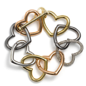
3. I love extra feminine details like the bow on the bauble bar bracelet since I'm post marriage or would you say post divorce. I guess it's a girl and freedom thing!
4. Love this striped shirt in red from J. Crew. I don't have a red striped shirt yet, I may have to add this to my "striped" shirt collection.
5. I love the natural border that privet hedges provide. Yes, they can be high maintenance but I still love them. They conjure up thoughts of beautiful pathway and gardens for me.
6. This moody painting by Jong Ro would add drama to any room.

Rabu, 08 Agustus 2012

The black and white of it....


I will forever be drawn to this sharp color palette of contrasts! It's wonderfully perfect when thrown off with another color like camel, blue, green, pink, gold..etc. etc.

On a side note: I am DYING to go to Europe soon!! I'm so inspired by their street fashion and how amazing pinterest has been at bringing the images to my home/laptop


Selasa, 07 Agustus 2012

Bohemian Chic

So there are about three weeks of summer left, (in my mind anyway - September turns chilly pretty quickly in Boston) so I'm going to take full advantage of my summer frocks and the balmy weather! I'm loving the layered bohemian but uber chic look of Vogue's segment on Valerie Boster's  Five Days, Five looks, One Girl in Montauk article.  For more see Vogue here.


I love, love, love everything about this photograph and her look!


This dress, how great is this dress and her Lanvin shoes and jewelry?


Senin, 06 Agustus 2012

inspired!

Runway to Room

I'm not sure where I'm moving to yet, but my mid Fall deadline is quickly approaching. I am getting my ducks lined up in a row, but that's not going to stop me from pinning to my "new home" inspiration board on Pinterest. (feel free to follow my account!) I do know that I want my room to be comfortable, glamorous space space with a  Hollywood chic vibe! I'm thinking tones of camel, cream, white, gold, silver, white and black. I'm also going to throw a little deep and creamy pink into the girlie mix.


Kamis, 02 Agustus 2012

Can you mix metal finishes?

I love reader questions because they give  me a writing focus a post.  So here goes...

Can you mix metals in your finishes?  The answer is a resounding YES!!  You can also match all your finishes. I personally find that a  space can look  somewhat boring if you choose to slavishly match every metal finish, but that's me. I like harmony with some variety.

Marc Jacobs "Love Edge" Heart Bracelet shows that metals really do work well together.


Here are a few guidelines that will ensure that you have a cohesive look.

Work with what you like best
If you are renovating/ updating, choose the finish you like the best / is the most stylish and match to it. Be aware that a dull gold/brass look is trending right now as is chrome, and it may not be long before all that brushed nickel will have a new status.

Limit the variety of tones
If you already have things in silver tones (brushed nickel, pewter or chrome) consider mixing them with wrought iron or black finishes. Two to three tones would be the limit or you will end up with a hodge podge.

Connect with other tones in the room
In the picture below black is used predominately in the light fixtures while the faucet has silver tones and the handles are either pewter or brushed nickel, still in the silver family. Because black carries such visual weight it works best when there is something else black in the space to help anchor it.


Whitney Blair Custom Homes

The heavy black lighting fixtures in the previous picture would overwhelm this room because there's  little black in the space. The delicate application of black does not look out of place in the lighting.   


Many older homes have brass or copper fixtures that  look good  when paired with oil rubbed bronze or black. If you already have something that is dark in the room this is the tone you should select to supplement with. While copper and black breaks the keeping to the same tone guideline, it can work when you have other black furnishings.

Elaine Griffin Interiors

Copper in this space is paired with stainless steel and possibly pewter.  The copper is picking up the tones in the wood and your eye is moved around the space very nicely. It's all a matter of creating flow.


Mermaid of Honor

I'm thrilled to share this post today of a beautifully hosted and designed bridal shower by my dear friend Sarah. Sarah is not only one of the funnest people I know she's unbelievably talented at what she does. Her company Lil Hoot is well on its way since launching last year. Sarah's taste and attention to detail is amazing, she truly pours her heart into every event she plans! Congrats Ms. Sarah and Ashly (the bride to be). Everything looked gorgeous! These photographs wonderfully capture your day. (read on, below Sarah outlines the shower and details)


"my cousin, ashly, is my favorite person on the planet.  When she got engaged to her awesome fiancee Scott, I was beyond happy and since I am a party planner, I had already started planning the wedding and shower in my head months prior {obvs}.   I knew I wanted to enlist the help of industry faves, White Loft Studio, Chocolate Creative Design and Petal Floral Design {who are also Ashly's wedding vendors}.
I wanted the shower to personify Ashly - laid back, beautiful, and above all, fun!  My mom was happy to co-host with me and offer her coastal connecticut home as the venue.  She has a mermaid statue perched on her sea wall which was one of the inspirations for the event.  Ashly has always loved the beach {so much so she resides on Nantucket!} so I wanted to incorporate seaside and beachy elements without being trite.  She also isn't your typical bride and was not comfortable with the traditional shower concept so we set out to create a "cocktail hour shower" announcing "one less lovely fish in the sea".  


The invites, created by my lovely and talented friend Lucinda Wesson of Chocolate Creative Design, set the tone for the celebratory occasion perfectly.  Lucinda illustrated a darling mermaid holding a cocktail which was then printed with gold foil on the invites, complimenting the pink, coral and aqua color scheme.  The RSVP was to go to the "mermaid of honor".  Envelopes were lined with an aqua and gold glittered scallop pattern.

The scallop pattern, bubbles and mermaids were to be found everywhere from the pattern of my mom's stone patio to the cocktail napkins.  Lucinda created a custom stamp for the napkins with the mermaid from the invite and the don ho lyrics  'tiny bubbles in the wine, make me happy, make me feel fine".  
The sweets were originally to be set up on the sea wall but the weather didn't cooperate.  Instead we set up the dessert table inside with subtle seaside elements.
The gurgling cod was used for the floral centerpiece, which was composed of coral charm peonies and other gorgeous blooms, {also a gift to the bride to be}.  Vintage jadeite shell and cake stands to display pink champagne and mint macarons, seashell and starfish cookies, and a delicate scalloped cake with a peony fondant topper also graced the table.

Gold, pink and aqua confetti was sprinkled throughout the party space as well as a 'one less fish in the sea" mermaid fabric banner, made by Lucinda.   

Guests were served pink champagne in aqua and blush champagne flutes with gold and pink pom pom swizzle sticks.  A gold 'holla' sign was the focal point of the bar.  This was a perfect "prop" for our fun bride-to-be!

Sequined linens gave a shimmery seaside effect on both the bar and and sweets table.

There were multiple surprises in store for Ashly.  Her best friend from DC flew in for the event - Heidi of course captured the reaction of the elated bride perfectly.  Which brings me to my next surprise- Heidi of White Loft Studio, herself!  Ashly is thrilled to have her shoot her October wedding on Nantucket so her presence at the shower made her so happy, and even happier when we saw the pictures!  Heidi also delivered the gorgeous florals from Ashly's wedding florist, Petal Floral Design.

My 3 and half year old twin daughters are so excited to be flower girls and couldn't wait to make an appearance in their champagne tutus and bubble cardigans!  They also got a sneak peek at what their flower crowns for the wedding resemble {Becca from Petal Floral Design created a special one for the mermaid on the sea wall}

Cast iron mermaid bottle openers served as favors with a pablo picasso quote - 'love is the greatest refreshment of all'. These were hung from the chandelier above the bar.  Guests were also sent home with small bundles of glitter and other goodies to throw in the sea at a full moon {shower was 2 days before full moon} as part of a "mermaid love spell".

The bridesmaids also had fun posing with the bride while she held a pink mermaids sign!

Looking forward to collaborating with all of these amazing vendors in October for the main event, and feeling so lucky that we get to have so much fun along the way. holla!"

event styling - Lil hoot
photography - white loft studio
invitation/paper goods/styling - chocolate creative design
cookies - sugar on top
holla sign - oh dier
linens- La Tavola

THANKS FOR SHARING YOUR BEAUTIFUL EVENT SARAH! 

xoxo,
Julie

Rabu, 01 Agustus 2012

with a voice

I'm drawn to designs and fashion with an identity. Spaces that leave an impression resonate with me. I like to take risks and though I am pretty much a new englander on many levels, a part of me definitely belongs in L.A.! With that said, I love the work of  L.A. designer Wendy Schwartz, it's edgy but livable. I really can't wait to move, I'll use my place as a laboratory of sorts....I'll be sure to try a few over the top but tasteful ideas..They usually photograph beautifully. Happy Wednesday.