yliix

Sabtu, 17 Maret 2012

Adding freshness to your home

  We are now in our fog  and freezing rain stage  after a winter of cold and snow.


Even my cheery yellow chairs which I see every day  from my kitchen window aren't  helping me feel like spring is just around the corner. I like gray, but not the gray that shrouds our island in  March.  So my thoughts go to spring which we won't get until late April or early May.


In the summer I always have flowers from my garden but in winter and early spring they are purchased.  There's nothing like flowers to bring nature and freshness into your space. Using colourful books on a table or changing pillow covers are  also  inexpensive way to perk up a room.  A throw over a chair, bed or sofa back is also an inexpensive way to add splashes of colour.


 Choosing art works  with vibrant colours will add instant freshness and warmth to a space.

 If you want that fresh feeling in your home look to  nature for your inspiration.  You will discover all the colours that make you happy. Use these colours  to develop a complete colour scheme or pick them up as accents.

Breakers Beach House contemporary bedroom
Viscusi Elson Interior Design - Gina Viscusi Elson via Houzz

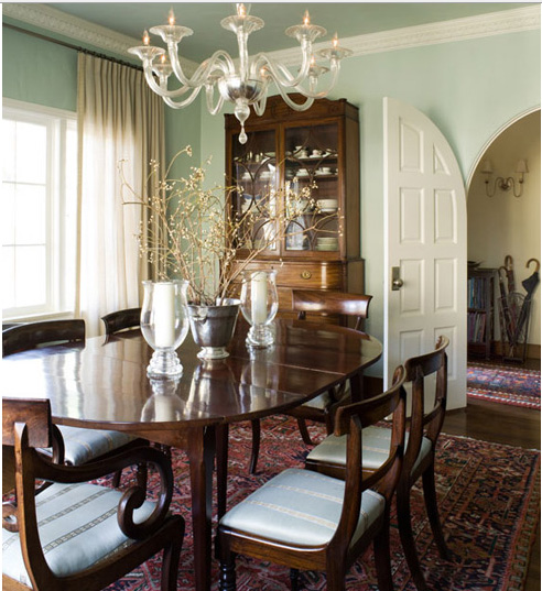
 Green is the ultimate fresh colour and when you pair it with white you will always have an inviting space.  Pillows or art work with nature inspired themes like leaves or flowers add a whole other layer of freshness to the blandest decor.


Poke small plants into a table top vignette and use nature inspired ceramics to create energy.  Botanical prints always work.


Sweet as a Candy eclectic hall
  Sweet as a Candy

Topiary  and wreaths laid horizontally  can add inviting touches of nature to arrangements.Again white is the perfect backdrop for green.
OLD BRAND NEW modern hall


 Camilla Molders Design contemporary living room

 If you're someone who can't keep a plant alive for longer than two weeks buy sculptural leaves and artfully add them  to your room. They have a long shelf life! 

Amoroso Design contemporary family room
 Amoroso Design

Bath contemporary bathroom

You don't need to break the bank when buying fresh flowers .  Make up for quantity by buying the most vivid blooms you can find and group them in threes. 


Vintage Residence contemporary dining room
Jessica Lagrange Interiors LLC

Use fresh fruit to add beautiful colour to your space. These green apples leap off the table in  this high contrast scheme.  Note the splashes of lavender blue too.
Somerly Clubroom eclectic living room
Niki Papadopoulos via houzz


Pillows and  other accessories can be quickly changed from room to room to make a space look new.  You never know where you will find objects in my house. Recycling what you already own adds freshness to your space.

Selasa, 13 Maret 2012

Thoughts on mixing wood tones


 Wood tones are often problematic when you  choose  a colour scheme or new furnishings.  Some  people  are willing to solve the problem by spending hours looking for furniture with the same wood tones. After all that work you may  end up with a boring room where everything looks the same and blends into each other.

An easier and more exciting approach is to mix wood tones in your decor to provide a more layered, interesting room. You can mix tones with confidence it you stick to a few basic guidelines.

Use your floor as the constant

 When choosing furniture you have to consider your floors if they are wood.  They are the constant against which all other wood tones will be compared.  If your floor has more that one colour you can safely choose any of those colours for other wooden furniture or  accessories.

Limit the number of tones 


Bernal Heights Residence contemporary kitchen wood tones

Generally, it’s best to limit the number of wood tones  to  two or three per room. In the room above only two wood tones are used. Hints of the darker tone can be found in the floor and this creates a very harmonious look. There is also good contrast between the floor and darker cabinets.That's important.

Choose one tone as the "star"


 mixing light and dark wood tones

If you have various wood tones or are buying new furniture, choose one of the wood tones as the dominant one.  Aim for uneven proportions. The room above is a very interesting balance of lights and darks.  When the rug and chairs are included in the mix  it's the cabinet that stands out the most. The  dark floor is acting as a backdrop.

Separate problem tones with a rug 


separating wood tones with area rug

 Sometimes you end up with all the same wood tones in a room and the only way to bring some variety is to separate the wood tones with an area rug so everything doesn't blend together. This also works when you have two different tones that don't work that well together. Separation breaks the comparison. 


Balance wood tones throughout a space


balance wood tones

 A close viewing of this room shows  light,  medium and dark wood tones which have been connected by spreading them around the room.  The dark table connects with the upholstery piece at the foot of the bed.  The armoire, legs and  mirror are mid to darkish and the floor is light providing good flow and contrast.


William Hefner Architecture Interiors & Landscape  balancing wood tones

If you choose dark tones for bookshelves banking a fireplace you need to have other dark tones around the room, preferably on the opposite side to move your eye through the room.

 Keep contrast controlled


Deep, dark, rich wood tones such as mahogany, cherry, and walnut will often go better with medium-toned woods than lighter ones. And likewise, lighter toned woods, such as pine and oak, will also go better with medium wood tones, rather than with dark. In other words, it is okay to use varying wood tones, but aim for a lower level of contrast. The room above has medium and dark wood tones.

Keep furniture the same tone


furniture choice wood tones
 Houzz

All the wood tones in this furniture are medium but they do not match perfectly.   When you keep  your major furniture pieces in the same wood tone, you can  bring in other  tones through accessories.  Wood frames, candlesticks, trays, sculpture,  or vases  are  obvious choices.
 

Consider the colour temperature of woods


colour temperature of wood Desinging Home Margaret Ryall
  Photography: Brian Ricks


Every wood has a colour temperature that needs to be considered. Natural ash, birch and maple tend to be cooler while other woods like oak and pine tend to be very warm with undertones of orange or yellow as they age.

Some stained woods  can show warm and cool tones at the same time.  This is ideal because then you can mix and match the wood tones in the space. When I'm choosing flooring for a client I look for finishes that will allow me to mix both warm and cool tones.In the room above the floor actually has more warms than the shot displays.

Use paint /upholstery to mimic a particular wood tone


Lorraine Vale traditional dining room paint tones matching wood


If you have one piece of furniutre that  is a different wood tone, you can use paint, window treatments or upholstery to mimic the wood tone and spread the colour around the room. The blinds and cabinet  work together. 

Most of us have wood tones somewhere in our homes and any renovations usually bring this issue to the forefront.  I would love to hear how you have dealt with the making wood tones work in your space.

Sabtu, 18 Februari 2012

Wallpaper as an accent


Having an accent wall is popular  in home decorating, but many decorators are very selective or down right negative about the idea. I wrote at length about accent walls in another post and listed 5 reasons to consider an accent wall. Accent walls either work well or are dismal failures. Make sure yours is in the successful category.  

Recently a reader requested that  I write a post about using wallpaper  to create a focus wall.  Ask and you shall receive. Here are my thoughts on the topic.

The most obvious wall


Golf House contemporary bedroom

 Any recessed area works well as an accent wall because it allows you to use the  architectural features of the room to good advantage. This bedroom shows how well a recessed feature can be highlighted . In addition, the paint colour totally supports the wallpaper design.  This is one of the biggest areas where you can mess up. 


Living Room Chic eclectic bedroom

This is another bedroom where the pattern beautifully accentuates everything else in the room.  The colour scheme is quiet and the wall colour blends well with the tones in the paper.  


This room has a completely different vibe with its pinkish red walls and white and black accent pattern.  It isn't a look I personally like because there is just too much colour for me. That doesn't make the design wrong. With the white furniture you really need  colour on the walls. 

Queensway master contemporary bedroom

The wall behind a bed is the most advantageous wall to accent The furniture placement  makes it the focal point in the room and you are merely enhancing it with your wallpaper choice.  Consider the effect that large mirrors have on this design.  The mirrored doors create two accent walls and the  impact effect is diminished and for some people it would be visually confusing..


 David Howell Design contemporary bedroom

How do you feel about the accent wall in this room? Do you think the designer choose the best wall to highlight? Does the wall colour work well with the colour scheme in the wallpaper?  My answer would be negative on all counts.  To be fair, one could argue the use of pattern on the opposite wall as a way to  distribute visual  weight in the room. There's always more than one way to look at design.

 To highlight furniture


Light coloured furniture always looks great with a pattern behind it.  When you add pattern that is this dark and strong remember to consider how it will look with what is happening in the next room. 


Don't be afraid of large scale pattern on one wall.  There is lots of pattern in this room, but it works because the designer stuck to a tight colour scheme. When you choose bold patterns remember how much harder you have to work to find art that will hold its own on the pattern.  The two small pieces  above are lost in the pattern.  Something bolder and larger would have been a better choice. Sometimes the devil is in the smallest details.  When you look at this design what is the first thing you notice?  For me it's the sofa and not the patterned end wall.  Perhaps this is what the designer wanted to achieve and that might account for the downplay of art on the wallpaper.  Again, more than one way to look at things. 

 Stand alone walls and dividers


Look for opportunities to wallpaper where you have stand alone walls that will work well as an accent.  Often temporary walls or stand alone walls are used as dividers in condos or basement apartments.  It is a way to divide space without closing it off. 

  Wallpaper as art


 Think about all the ways you could use wallpaper as art . Use trim to emphasize a design and fill in with wallpaper.  The sky's the limit for this. I particularly like the grid created for the dining room wall with two colours of wallpaper.  The colour tones work very well together.

Highlight a small area


 Fireplace walls  that extend beyond the  main wall offer a perfect place to add pattern.   You can be very bold because there isn't much pattern used.  Would you use these accents on the mantle or different ones?  Do they stand out or are the lost? Does the arrangement need some height.  Displaying objects against a bold pattern takes some thought . There's lots of choice in things to move around in this room. Check out lots of other images on this great post about wallpaper accents.


Define a  space with just a strip or two of wallpaper as a backdrop. 

And there you have it.  There are all kinds of ways to brighten your home with wallpaper accents.  This only scratches the surface.  You might want to refer to this other post I wrote on the topic last year. I also have a growing collection of ideas for your walls on Pinterest.

Rabu, 15 Februari 2012

No one will ever know

 You can never have too many vases or luminaries. Creating your own  from materials on hand is both fun and cost effective.  You also get to have the pleasure of looking at it every day and knowing that you upcycled something.  Of course, accolades from your friends and family don't go astray either.

  Here are some of my personal favourite ideas collected from  Pinterest.    Happy creating.


 I would use these for their sculptural value and forget the greenery which looks forced.  Get various shapes and sizes of clear wine bottles.  Tape off or use adhesive stickers to create design.  Spray paint white and there you have it.  So easy and they would look very interesting massed together on a table top or mantle.


So, so easy!  Use elastic bands  to stretch around  around the clear cylinder vase .  Vary the position of the bands and make sure you have some overlapping, then spray paint. When the candles are lit the design is greatly enhanced. You can now buy battery powered candles which would work best in something this tall.


Check out the very detailed instructions for creating this tissue paper collaged vase.


 You may have seen this idea in Canadian House & Home.   Wait for a nice day where you can take your spray paint outside. Clean (remove any labels and adhesive)  and dry the bottles and then by pouring a dollop of paint into the bottle, gradually rotate/swirl the paint inside until the paint coats the entire interior. Some may need two coats. Dry on a damp or plastic dropsheet.  I think the colour you use will make or break this look.  I'm particularly fond of the sea glass green blues.
Update: Watch a video how-to by Stephanie White on House and Home's TV.


 Print your photo on Lazertran paper, making sure the image prints on the chalky eggshell side. Let dry for 30 minutes. Cut the image to size. Soak the printout facedown in a pan of water for about a minute. Peel off the backing and place the filmy printout onto a ceramic vase, smoothing out any air bubbles.


These look stunning and they are so, so easy to make using Krylon  Looking Glass Mirrorlike  Spray Paint. Clean out the vases/votive,  spray the interiors lightly with water and then with mirror paint. Turn upside down and let dry overnight.  Repeat the process if the first application looks too sheer. If you want to use them for flowers you have to inert a small glass inside to hold the water. Imagine the beautiful table centerpiece these would create using some with flowers and some with candles.


Selasa, 07 Februari 2012

5 +1 Design Solutions

Every home has challenges- not enough  storage space, oddly shaped rooms, nowhere to put the TV etc.  There is always a good design solution for every problem. All it takes is patience to look for the solution or some thought to figure it out yourself.  Sometimes the solution is a mixture of the two.     Do any of these ideas help solve a design problem in your house?


 No  space  for a desk

 
 Pinterest

So you think you have no room for a small desk in a room.  I love this idea of a fold up desk that turns into a framed art work.
  
Space too open


A floating wall of this type serves to partially separate a space while adding a place  to locate furniture.

 
No wall for a TV


                                                                    Pinterest

What about no wall space for a TV?  This happens in many open area homes, but there are solutions as you can see. 

No space for a buffet


Sometimes taking space from another room or a hallway is an option.  This buffet fits perfectly into a small space. 

Small foyer

Pinterest


When you have a small entrance space consider fooling the eye by using a large mirror and layering furniture in front of it.  This sleek table accepts a bench below it very nicely.  It looks good but the bench is also functional.

Looking for a home office


This is such a great solution for a small space.  The trunk can do double duty as a coffee table and a space to lay your laptop when the lid is closed


t

Kamis, 02 Februari 2012

Does a ceiling have to be white?


That's an easy one.  Of course the answer is no, but very few people veer away from this standard. If you're feeling adventurous and want to break away from the pack  here are some suggestions.

Consider practicalities 
When you decide to paint your ceiling a colour you need to think about  how that colour will flow into other rooms both physically and visually.

Is there a place (e.g., molding or beam) where you can stop the colour? 
      Minimalist kitchen design modern kitchen
       The ceiling in the kitchen is on a different plane than the living room, thus providing an easy break for painting.
      How will the colour look when viewed from the next room or rooms?
        In the room above the ceiling is acting as an "accent wall" and flows nicely into the living room.  The same blue is used in hints around the room creating a visual flow.

        Will you have to  change the colour again when you paint your walls? 
        Chances are you will.  Are you up to painting several coats to cover a colour?


        Is your ceiling in good condition?  
        Flaws will show up more with darker colours.

          Consider ceiling height
          How high is your ceiling?  Nine feet or above will provide lots of height for darker or warmer colours.

          Beverly Bradshaw Interiors, Seattle, WA eclectic dining room

          Luxurious Gold and Silver Painted Dining Room Ceiling traditional dining room

           However, if you have standard ceilings (8 feet) and your rooms are smallish you might consider lighter, cooler colours to help the ceiling recede and give the feeling of greater distance.


            Traditional Home
          Blue seems to be a popular ceiling colour.


          Consider your  wall colour

          If you really want to paint your ceiling and aren't sure which colour to choose, take the cue from your wall colour and simply go several values lighter.

           Toby Fairley 

          Or keep the ceiling and walls the same colour and break it up with crown moulding.....

           or go a value or two darker for the ceiling.


          Consider your trim colour
           If you have a trim colour other than white/cream, look to it for ideas for your ceiling.These room have a very pulled together look by using the trim  colour  as a branching off point.

          Real Simple
           The ceiling is darker than the trim colour

          Residences in DeBordieu Colony, Georgetown, SC traditional living room

           The ceiling is the same colour as the trim. 


          Consider your accessories 
          This is where things could get exciting...
          tineke triggs contemporary bedroom

          Can you imagine this room with a red ceiling?
          Hollywood Residence eclectic dining room